
A few weeks back I wrote an article diving into NHL play-by-play shots, how the turn into rebounds, and how those two events affect the outcome of games.
In the piece you are reading now, I wanted to look at the same analytics from a different perspective. I hope that it will help inform prospective/new data scientists on how to start building your own projects and give some clarity on how I think.
Find the Right Question
Finding the right question is often the hardest part of starting a new data science project - especially when this is not given to you. It is hard to find the motivation to follow through on a project that has no real purpose, and spending time on defining what you are doing is vitally important.
I like to go for long walks and ponder the dataset, what might be achieved with it, and what kind of questions I might answer. With this project, I had access to play-by-play data on every NHL game in the past ~4 years, and I wanted to build a system for predicting the outcome of games.
The motivation behind doing this is summed up in Vox’s video below. NHL outcomes are considered to largely be an outcome of luck. On the luck-skill continuum, hockey is categorized to be one of the most ‘random’ sports. I had my doubts, and I wanted to dig into this a bit more.
Digging In
As I thought more about how to approach the problem, I realized how complex the system I wanted to build would be. To start, I had no idea what data is known to be correlated with winning - more importantly it didn’t seem that anyone else really did either. Research had obviously been done on various aspects of the game, but I couldn’t find a perfect starting point for what I wanted to do.
To tackle the problem, I would start with more straightforward questions and build up to a final model. I expect that this project will consume hundreds of hours and likely crawl into the thousands as time goes on - but you need to start somewhere. I decided to systematically move through various parts of the game in a set of what I call “Deep Dives.” Those Deep Dives would build on my understanding of the domain as a whole, but also turn out features I could use in my final model.
So I built a flexible plan to tackle these one at a time. I didn’t know how long I would spend on each section - a choice that would allow me to decide on whether to pursue an idea further if needed. Some of the data I would dig into would inevitably be fairly non-intuitive and likely to encourage more exploration.
After some initial exploratory digging, I landed on the following strategy:
- Dive into the following categories one-by-one to find meaningful correlations in the data
- Shooting
- Penalties
- Hitting
- Turnovers
- Goaltending
- Home/Away Advantages
- I would then take the insights I had found and build them into prediction system.
It became clear early on in my analysis that this would be a difficult task. I’ve absorbed myself in shooting statistics and have seen first hand why many statisticians have chalked so much up to chance. However, I’ve also found a few interesting pieces of information I did not know before (and couldn’t find any other information on).
Most importantly, I started to get a feel for a very specific part of the game. It leads me to believe that there are a lot of features that can be built that are predictive over entire seasons, but that those same statistics are full of noisy outliers. I have a nagging suspicion that NHL is a very momentum based game, that how a team acts on a longer-term basis is predictive of their success, and that behaviors are more important than individual stats such as goals or shots. One of the critical takeaways from that piece can be explained in the following three graphs.
First, we found out what a rebound was.
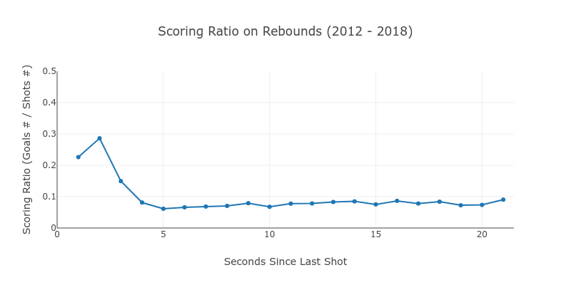
Second, we look at the number of occurrences to gauge the importance.
Finally, we looked at all teams over the last 4 years to find out how this information might be predictive of outcomes.
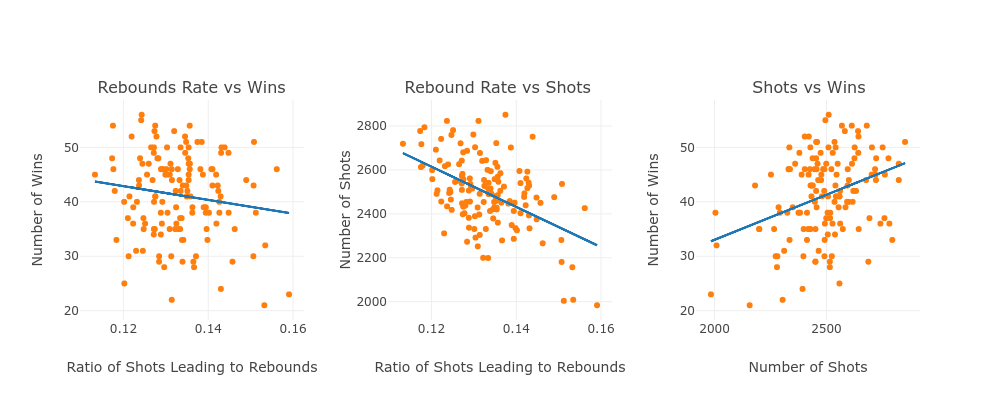
Our conclusion.
“Over the data analyzed, a higher rebound rate does not actually correlate with a better win percentage. In fact, a higher rebound rate is associated with a lower number of wins!
We also find that a higher rebound rate has a strong relationship with fewer shots taken and also see that more shots = more wins.”
Code Walkthrough
To better inform the process, and to give you an idea of how I went about getting here, I’ve offered a few interested people to walk through the code. To start, you can get the raw data here. We won’t use all the datasets, and our primary focus is on the play-by-play data.
Our first step is to load the play-by-play data, extracts goals and shots, create columns that identify the shooters and goalies, and scale the x and y locations so that we can show our shooting analysis on a hockey plot that I’ve made on Plotly.
import pandas as pd
from tqdm import tqdm
import time

def load_shooting_df():
    # Get Shot on and Against
    plays_df = pd.read_csv('data/game_plays.csv')
    shooting_df = plays_df.loc[plays_df.event.isin(['Goal', 'Shot']), :]

    # Format Shot by and Goalie
    shooting_df = shooting_df.assign(shot_by=shooting_df['description'].apply(
        lambda x: ' '.join(x.split()[0:2])).values)

    shooting_df = shooting_df.assign(goalie=shooting_df['description'].apply(
        lambda x: ' '.join(x.split()[-2:])).values)

    # X and Y are inverted in the dataset vs our chart
    shooting_df = shooting_df.assign(
        X=shooting_df['st_y'].apply(lambda x: x * 500 / 85).values)
    shooting_df = shooting_df.assign(
        Y=shooting_df['st_x'].apply(lambda x: x * 500 / 85).values)
    # ignore shots below center ice
    shooting_df = shooting_df.loc[shooting_df['Y'] > 0, :]
    shooting_df = shooting_df.loc[shooting_df['Y'] < 516.5, :]
    return shooting_df
Then, we write a function that takes the output of the shooting_df function and adds some data that we’ll need. We’ll add in team names, build out the dataset so we can analyse home/away instead of win/loss.
def load_expanded_shooting_df():
    shot_df = load_shooting_df()

    # Load Team Info
    team_info = pd.read_csv('data/team_info.csv')
    team_info['combined_name'] = team_info.shortName + ' ' + team_info.teamName
    team_info.drop(
        ['franchiseId', 'shortName', 'teamName', 'abbreviation', 'link'],
        axis=1,
        inplace=True)

    # Load Games Dataset
    games_df = pd.read_csv('data/game.csv')
    games_df.drop(['venue_link', 'venue_time_zone_id'], axis=1, inplace=True)

    # Load and Drop Unused Columns
    team_info = pd.read_csv('data/team_info.csv')
    team_info['combined_name'] = team_info.shortName + ' ' + team_info.teamName
    team_info.drop(
        ['franchiseId', 'shortName', 'teamName', 'abbreviation', 'link'],
        axis=1,
        inplace=True)

    # Create home and away datasets for joining
    away_info = team_info.copy()
    away_info.columns = ['away_team_id', 'away_team_name']
    home_info = team_info.copy()
    home_info.columns = ['home_team_id', 'home_team_name']

    # Merge Columns
    games_df = games_df.merge(away_info)
    games_df = games_df.merge(home_info)
    shot_df = shot_df.merge(games_df, on='game_id')

    # Get unique games
    unique_games = shot_df.game_id.unique()
    print("Loaded {} Unique Games".format(len(unique_games)))
    time.sleep(0.5)  # For printing issue in notebooks
    return shot_df, unique_games
Now we’ll build our dataset we’ll use in the final analysis. I wanted to determine what a rebound was so I could use that information to identify good shot locations. Since there was no clear definition I could apply I needed to analyze this myself.
I run a loop over the unique games in the dataset and sort each game chronologically. I can then iterate shot by shot over the dataset and build out the time between shots, the outcome of those shots, and the location of the rebound. We then add a few necessary columns that allow us to cut the data in a few different ways for analysis, specifically adding a ‘for’ column so we can look at teams across their entire season.
def load_rebounds_df():
    shot_df, unique_games = load_expanded_shooting_df()
    shot_df['shotTimeDiff'] = 0
    shot_df['nextShotResult'] = 'None'
    shot_df['nextShotX'] = 0
    shot_df['nextShotY'] = 0
    for gameid in tqdm(unique_games):
        game_shot_df =\
            shot_df.loc[shot_df.game_id == gameid, :].sort_values('play_num')

        # Set Home and Away Team
        away_df = game_shot_df.loc[game_shot_df.team_id_for == game_shot_df.
                                   away_team_id, :]
        home_df = game_shot_df.loc[game_shot_df.team_id_for == game_shot_df.
                                   home_team_id, :]

        # Add shotTimeDiff column
        shot_df.loc[away_df.index.values, 'shotTimeDiff'] = \
            -away_df['periodTime'] + away_df['periodTime'].shift(-1)
        shot_df.loc[home_df.index.values, 'shotTimeDiff'] = \
            -home_df['periodTime'] + home_df['periodTime'].shift(-1)

        # Add nextShotResult
        shot_df.loc[away_df.index.values, 'nextShotResult'] = \
            away_df['event'].shift(-1).values
        shot_df.loc[home_df.index.values, 'nextShotResult'] = \
            home_df['event'].shift(-1).values

        # Add column on data from next shot
        shot_df.loc[away_df.index.values, 'nextShotX'] =\
            away_df['X'].shift(-1).values
        shot_df.loc[home_df.index.values, 'nextShotY'] =\
            home_df['Y'].shift(-1).values

    # Only review regular eason games
    type_df = pd.read_csv('data/game.csv')[['game_id', 'type']]
    shot_to_reb = shot_df.merge(type_df)

    # Add for and for-name column
    shot_to_reb['for'] = 'mismatch'
    shot_to_reb.loc[shot_to_reb.team_id_for == shot_to_reb.
                    home_team_id, 'for'] = 'home'
    shot_to_reb.loc[shot_to_reb.team_id_for == shot_to_reb.
                    away_team_id, 'for'] = 'away'
    shot_to_reb['for_name'] = 'None'
    shot_to_reb['season'] = shot_to_reb['game_id'].apply(lambda x: str(x)[0:4])

    shot_to_reb.loc[shot_to_reb['for'] == 'away', 'for_name'] =\
        shot_to_reb.loc[shot_to_reb['for'] == 'away', 'away_team_name']
    shot_to_reb.loc[shot_to_reb['for'] == 'home', 'for_name'] =\
        shot_to_reb.loc[shot_to_reb['for'] == 'home', 'home_team_name']

    # Add Rebound and Counter Col (for aggs)
    shot_to_reb = shot_to_reb.assign(lead_to_reb=shot_to_reb.shotTimeDiff <= 3)
    shot_to_reb['counter'] = 1
    return shot_to_reb
To get a better understanding of what a rebound is, we need to aggregate our rebounds dataframe by timesteps . At the same time I added a few text columns for the Plotly chart that we’ll use to get a better picture of the impact of rebounds and the rate of scoring.
def agg_rebounds_df():
    shot_df = load_rebounds_df()

    # Aggregate by Time Differential
    shot_df = shot_df[shot_df.shotTimeDiff > 0]
    shot_df_agg = shot_df.groupby('shotTimeDiff').agg({'counter':'sum'})

    # Aggregate shots and goals
    shot_df_agg = shot_df.groupby(['shotTimeDiff','nextShotResult'])\
        .agg({'counter':'sum'}).reset_index()

    # Create pivot table
    shot_df_agg = shot_df_agg.pivot_table(aggfunc='sum',
                                          columns=['nextShotResult'],
                                          fill_value=0,
                                          index=['shotTimeDiff']).reset_index()

    # Drop multilevel and add ratio
    shot_df_agg.columns = shot_df_agg.columns.droplevel()
    shot_df_agg.columns = ['shotTimeDiff','numGoals','numShots']
    shot_df_agg['goalRatio'] = shot_df_agg['numGoals'] /\
    (shot_df_agg['numGoals'] + shot_df_agg['numShots'])

    #Set Minimum Shots for Differential
    shot_df_agg = shot_df_agg[shot_df_agg.numShots > 1500]
    shot_df_agg['goalRatioText'] ='Time b/w Rebound = ' \
        + shot_df_agg['shotTimeDiff'].apply(lambda x: str(x))\
        + ' <br>Scoring Ratio = ' + shot_df_agg['goalRatio'].apply(lambda x:"{0:.2f}%".format(x * 100))\
        + ' <br>Number of Shots = ' + shot_df_agg['numShots'].apply(lambda x: str(x))\
        + ' <br>Number of Goals = ' + shot_df_agg['numGoals'].apply(lambda x: str(x))
    return shot_df_agg
That allows us to create the first two plots we looked at above that gave us an idea what a rebounds was.
## Scoring Ratio Chart
shotTimeData = go.Scatter(
    x=shot_df_agg.loc[0:20, 'shotTimeDiff'],
    y=shot_df_agg.loc[0:20, 'goalRatio'],
    mode='markers+lines',
    text=shot_df_agg.loc[0:20, 'goalRatioText'],
    hoverinfo='text')
data = [shotTimeData]

## Layout
layout = go.Layout(
    title='Scoring Ratio on Rebounds (2012 - 2018)',
    height=400,
    width=800,
    yaxis=dict(range=[0, 0.5], title='Scoring Ratio (Goals # / Shots #)'),
    xaxis=dict(range=[0, 21.5], title='Seconds Since Last Shot'))

#Fig and Plot
fig = go.Figure(data=data, layout=layout)
iplot(fig)
## Number of Goals/Shots Chart
numGoalsData = go.Scatter(
    x=shot_df_agg.loc[0:20, 'shotTimeDiff'],
    y=shot_df_agg.loc[0:20, 'numGoals'],
    mode='markers+lines',
    name='Goal Count')
numShotsData = go.Scatter(
    x=shot_df_agg.loc[0:20, 'shotTimeDiff'],
    y=shot_df_agg.loc[0:20, 'numShots'],
    mode='markers+lines',
    name='Shot Count')
data = [numGoalsData, numShotsData]

## Layout
layout = go.Layout(
    title='Goal and Shot Count for Rebounds (2012 - 2018)',
    height=400,
    width=800,
    xaxis=dict(range=[0, 21.5], title='Seconds Since Last Shot'),
    yaxis=dict(title='Number of Shots and Goals'))

#Fig and Plot
fig = go.Figure(data=data, layout=layout)
iplot(fig)
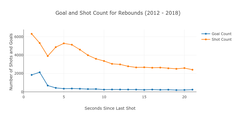
Knowing that there was a sharp uptick in goals for shots under 3 seconds, I categorized rebounds by any shot where the previous shot was under that timeframe. It gave us a good picture of the overall impact of rebounds.
def agg_rebounds_df2():
    ## Aggregate shots and goals
    shot_df = load_rebounds_df()
    shot_df_agg2 = shot_df.groupby(['shotTimeDiff', 'nextShotResult']).agg({
        'counter':
        'sum'
    }).reset_index()

    ## Create pivot table
    shot_df_agg2 = shot_df_agg2.pivot_table(
        aggfunc='sum',
        columns=['nextShotResult'],
        fill_value=0,
        index=['shotTimeDiff']).reset_index()

    ## Drop multilevel and add ratio
    shot_df_agg2.columns = shot_df_agg2.columns.droplevel()
    shot_df_agg2.columns = ['shotTimeDiff', 'numGoals', 'numShots']
    shot_df_agg2['goalRatio'] = shot_df_agg2['numGoals'] / (
        shot_df_agg2['numGoals'] + shot_df_agg2['numShots'])
    return shot_df_agg2
And the Plotly chart below.
reb_goals = shot_df_agg2.loc[shot_df_agg2.shotTimeDiff <= 3, 'numGoals'].sum()
reb_shots = shot_df_agg2.loc[shot_df_agg2.shotTimeDiff <= 3, 'numShots'].sum()

norm_goals = shot_df_agg2.loc[shot_df_agg2.shotTimeDiff > 3, 'numGoals'].sum()
norm_shots = shot_df_agg2.loc[shot_df_agg2.shotTimeDiff > 3, 'numShots'].sum()

## Data
data = go.Bar(
    x=['Shots', 'Goals'],
    y=[reb_shots / norm_shots, reb_goals / norm_goals],
    name='Goal Count')

## Layout
layout = go.Layout(
    title='Rebound as a Proportion of Total (Shots and Goals)',
    height=400,
    width=800)

#Fig and Plot
fig = go.Figure(data=[data], layout=layout)
iplot(fig)
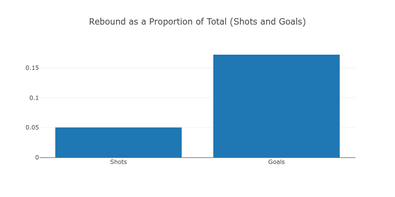
While shots leading to rebounds make up only 5% of all shots, they make up more than 15% of the all goals scored.
I also wanted to see whether there was a pattern to quality shots. The code for producing the heatmap on a rink is long - so I won’t embed it all here, but you can find it at this link.
At a high level we run through the following:
- We create various Plotly shapes that produce an empty hockey rink as a plot. The X and Y axis are used to simulate one half of the arena.
- We create a set of boxes that split the half-rink into 625 equally sized boxes (25 x 25).
- We take a subset of the data whom’s shots to fit within the x-y coordinates created for the boxes in the previous step. We then color this as desired (shots, goals, or goal-ratios)
- We produce a data point at the center of each box to provide mouse-over information.
The result is below (interactive version here)
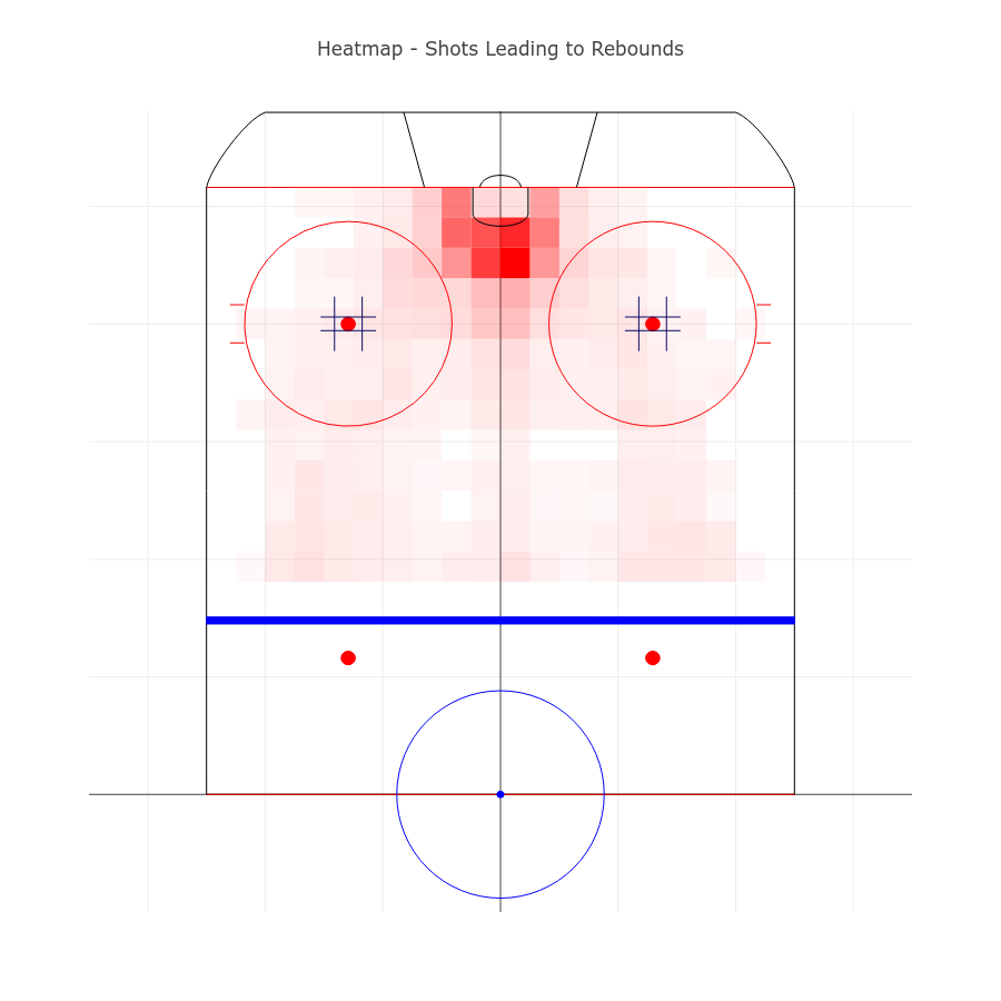
I reviewed a few variations of this plot to better understand shot location. Nothing non-obvious jumped out, but it gave some ideas of creating a feature that involves the use of these boxes to produce a shot-quality metric in some further analysis. Going from noisy data like this to predictive features can involve several stages.
To better understand shot location, I reviewed a few variations of this plot. Nothing non-obvious jumped out, but it gave some ideas of creating a feature that involves the use of these boxes to produce a shot-quality metric in some further analysis. Going from noisy data like this to predictive features can include several stages.
def get_seasonal_reb_df():
    shot_to_reb = load_rebounds_df()
    ## Use only regular season
    shot_to_reb = shot_to_reb[shot_to_reb.type == 'R']

    rebound_df = shot_to_reb.groupby(['for_name', 'season', 'lead_to_reb']).agg({
        'counter':
        'count'
    }).reset_index()

    rebound_df = rebound_df.pivot_table(
        index=['season', 'for_name'], columns='lead_to_reb').reset_index()
    rebound_df.columns = rebound_df.columns.droplevel()
    rebound_df.columns = ['season', 'team_name', 'no_rebound', 'rebound']

    rebound_df['total_shots'] = rebound_df['no_rebound'] + rebound_df['rebound']
    rebound_df['rebound_ratio'] = rebound_df['rebound'] / rebound_df['total_shots']

    ## Remove 2012 (only half a season)
    rebound_df = rebound_df[rebound_df.season != '2012']

    ## Get seasonal data and merge
    seasonal_df = get_seasonal_summary('R')
    seasonal_df = rebound_df.merge(
        seasonal_df,
        right_on=['season', 'combined_name'],
        left_on=['season', 'team_name'])

    #Remove season-team pairs with far too low shot count in the play_df
    seasonal_df = seasonal_df[seasonal_df.total_shots > seasonal_df.shots * 0.75]
    return seasonal_df
Then we have a relatively long code-snippet to produce the Plotly chart we saw in the original article.
We take three x-y pairs.
- Rebound Ratio vs. Number of Wins
- Rebound Ratio vs. Number of Shots
- Number of Shots vs. Number of Wins
# Generate linear fit and chart 1
slope, intercept, r_value, p_value, std_err = stats.linregress(
    seasonal_df['rebound_ratio'], seasonal_df['win'])
line = slope * seasonal_df['rebound_ratio'].values + intercept

ch1_data = go.Scatter(
    x=seasonal_df['rebound_ratio'].values,
    y=seasonal_df['win'].values,
    mode='markers',
    marker=go.Marker(color='rgb(255, 127, 14)'),
    name='Data')

ch1_fit = go.Scatter(
    x=seasonal_df['rebound_ratio'].values,
    y=line,
    mode='lines',
    marker=go.Marker(color='rgb(31, 119, 180)'),
    name='Fit')

# Generate linear fit and chart 2
slope, intercept, r_value, p_value, std_err = stats.linregress(
    seasonal_df['rebound_ratio'], seasonal_df['shots'])
line = slope * seasonal_df['rebound_ratio'].values + intercept

ch2_data = go.Scatter(
    x=seasonal_df['rebound_ratio'].values,
    y=seasonal_df['shots'].values,
    mode='markers',
    marker=go.Marker(color='rgb(255, 127, 14)'),
    name='Data',
    xaxis='x2',
    yaxis='y2')

ch2_fit = go.Scatter(
    x=seasonal_df['rebound_ratio'].values,
    y=line,
    mode='lines',
    marker=go.Marker(color='rgb(31, 119, 180)'),
    name='Fit',
    xaxis='x2',
    yaxis='y2')

# Generate linear fit and chart 3
slope, intercept, r_value, p_value, std_err = stats.linregress(
    seasonal_df['shots'], seasonal_df['win'])
line = slope * seasonal_df['shots'].values + intercept

ch3_data = go.Scatter(
    x=seasonal_df['shots'].values,
    y=seasonal_df['win'].values,
    mode='markers',
    marker=go.Marker(color='rgb(255, 127, 14)'),
    name='Data',
    xaxis='x3',
    yaxis='y3')

ch3_fit = go.Scatter(
    x=seasonal_df['shots'].values,
    y=line,
    mode='lines',
    marker=go.Marker(color='rgb(31, 119, 180)'),
    name='Fit',
    xaxis='x3',
    yaxis='y3')

#Set Figure
fig = tools.make_subplots(
    rows=1,
    cols=3,
    subplot_titles=('Rebounds Rate vs Wins', 'Rebound Rate vs Shots ',
                    'Shots vs Wins'),
    horizontal_spacing=0.1)
fig.append_trace(ch1_data, 1, 1)  #rebs predicting wins
fig.append_trace(ch1_fit, 1, 1)

fig.append_trace(ch2_data, 1, 2)  #rebs predicting shots
fig.append_trace(ch2_fit, 1, 2)

fig.append_trace(ch3_data, 1, 3)  #shots predicting wins
fig.append_trace(ch3_fit, 1, 3)

#Set Axis
fig['layout']['xaxis'].update(title='Ratio of Shots Leading to Rebounds')
fig['layout']['xaxis2'].update(title='Ratio of Shots Leading to Rebounds')
fig['layout']['xaxis3'].update(title='Number of Shots')

fig['layout']['yaxis'].update(title='Number of Wins')
fig['layout']['yaxis2'].update(title='Number of Shots')
fig['layout']['yaxis3'].update(title='Number of Wins')

fig['layout'].update(
    height=400,
    width=1000,
    title=None,
    showlegend=False,
)

iplot(fig)
We found some non-intuitive information here which led me to my pre-stated belief that features in hockey are more relevant over a period of time rather than a single game. We also uncovered something that might lead us to another set of features. Perhaps we need to adjust the number of shots or the rebound ratios for the types of teams and the quality of goalies?
Just the Start
This is just the start of such an analysis. We’ve barely even breached the surface of this complex game, but we have discovered some potentially valuable features and gained a bit of domain knowledge.
I hope that this article does some good for new data scientists, gives an idea of how important exploratory data analysis is and puts project design in perspective.
Play the long game, find the intricate details, then start modeling. You’ll end up with a far better model, and exit with an invaluable breadth of domain knowledge that helps you as you move forward.